Dashboard/Wallboard User Interfaces #
Both the dashboard & wallboard have similar user interfaces. Each supports different views which can be configured to show different statistics/filters based on different user or departmental requirements.
Views #
Each view is a collection of tiles which can be configured to show a range of statistics. Multiple views1 can be created within the dashboard and wallboard areas of the workspace.
Selection #
The view selector provides a quick way to switch between configured views:
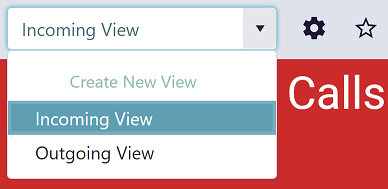
Users can switch between views as required.
info
When switching views, it can take a few seconds to initialize the new tile information and apply any filters.
Settings #
Each view has settings which control how the tiles on the view are sized/located and how the default appearance for new tiles is chosen. These setting differ between Dashboard and Wallboard views.
Dashboard #
Display Options
The Dashboard provides a working area where users can size and position tiles as required. The only setting which applies tile location, controls whether tiles anchor to the top of whatever is above them or stay where they are.
- Anchor tiles to the top enabled - If a tile at the top of the view is removed, tiles below will automatically move upwards taking its place.
- Anchor tiles to the top disabled - If a tile at the top of the view is removed, tiles below will stay in their existing location.
Default = Enabled
Color Palette
The Dashboard uses a combination of themes and dark mode setting to control the colors of tiles. Themes can be changed as required or custom colors can be used to override themes on individual tiles. By default, any new tile added to a view will use a color the selected theme.
info
If the color palette is changed on a view, the color of any tile using one of the theme's standard colors will be automatically update.
Wallboard #
Layout Options
The layout options of a Wallboard provide some control over the grid layout of a uniform display mode. The table below lists the different layout options available and the provides a description of the features of each.
| Layout Options | Description |
|---|---|
| Dynamic | The number of rows and columns is handled automatically by the system. As tiles are added, the row/column count will be updated for best fit. |
| Fixed Rows | The number of rows on the view will be fixed to the specific value. As tiles are added, the number of columns will increase dynamically. |
| Fixed Columns | The number of columns on the view will be fixed to the specific value. As tiles are added, the number of rows will increase dynamically. |
Color Mode
The color mode controls how the text and background colors are automatically chosen for newly created tiles. Colors will be randomly picked to fit the configured color mode, helping to speed up configuration of new views. Color mode only affects the default appearance for new tiles added to a view. Once added to a view, the tile appearance can be overridden as required.
| Color Mode | Description |
|---|---|
| Colored background | A new background color is selected based on the tile's location with a white text for each new tile. |
| Colored text, light background | A new text color is selected based on the tile's location with a white background for each new tile. |
| Colored text, dark background | A new text color is selected based on the tile's location with a black background for each new tile. |
| Monochrome (light) | A white background and black text is selected for each new tile. |
| Monochrome (dark) | A black background and white text is selected for each new tile. |
The color mode does not apply to image and video tiles.
info
Changing the Color Mode will not affect existing tiles, only new tiles added to a view.
Full Screen View #
Each view provides a full screen mode which removes the browser frame and application menus to render the current view to the entire screen.
Full screen mode can be activated by click the far right icon on the view options menu:

info
Full screen mode can be toggled off by pressing F11.
Cloning Views #
To simplify the process of creating multiple views, existing views can be cloned and then modified to save having to create views again from scratch.
To clone an existing view, follow these steps:
- Load the source view by selecting it in the view drop-down
- Open the settings form by selecting the cog icon to the right of the view selection drop-down
- Provide a new name for the view
- Select 'Save as new' from the Save drop-down option button
A new view will now be created with the settings of the source view but with the new name that was provided. This view can then be edited as required.
-
License permitting. ↩︎